Gotta say, that is worse. Slow clap for them.View attachment 2410Cincy’s academic logo is atrocious
You are using an out of date browser. It may not display this or other websites correctly.
You should upgrade or use an alternative browser.
You should upgrade or use an alternative browser.
News New George Mason Logo
- Thread starter The Great PATSby
- Start date
Looks like the image is still loadingView attachment 2410Cincy’s academic logo is atrocious
- Thread Starter
- #683
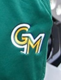
The baseball team should have been exempt from using the new logo. They should keep the baseball GM forever. The hat looks awful... especially when paired with the uniform with the old logo.

LOL. There has to be a uniform update coming later right? .....right? Otherwise this is sooo bad.The baseball team should have been exempt from using the new logo. They should keep the baseball GM forever. The hat looks awful... especially when paired with the uniform with the old logo.
View attachment 2417
These look like either pajamas or 1920s prison uniforms.The baseball team should have been exempt from using the new logo. They should keep the baseball GM forever. The hat looks awful... especially when paired with the uniform with the old logo.
View attachment 2417
Last edited:
InterVarsity
Walk-On
These look like either pajamas or 1920s prison uniforms.
Attachments
The current Hitting coach for baseball is on my softball team, along with another ex-mason bball player who set a lot of records for Mason bball hitting wise. The old player came to our games this past Monday with a black hat and green GM letters with gold outlined - never seen that hat before, looked pretty decent. He stated the hat is for alternate uniforms they will wear this year.
Hitting coach mentioned they brought in around 20 transfers/incoming new kids to the team this year. He thinks they upgraded in many spots this year. Should be an interesting baseball year.
Hitting coach mentioned they brought in around 20 transfers/incoming new kids to the team this year. He thinks they upgraded in many spots this year. Should be an interesting baseball year.
emjayar08
Starter
Mason MBB just posted some photos of the team leaving for Milwaukee. Noticed a new color/order variation of the new logo.
Don’t hate it, they’re being somewhat creative with a simple logo, but I’m sure this goes against their stated set of branding rules…
Don’t hate it, they’re being somewhat creative with a simple logo, but I’m sure this goes against their stated set of branding rules…
Attachments
GunstonsGhost
Starter
I heard a kid behind me at the game ask what "TM" meant. I didn't catch if he got a response, but I imagine it was similar to my saddened shrug.
CTS was wearing a pullover at his Coach's Show that looked like that, too.Actually not too bad. I could get used to that. Even buy something.
Looks like it came from a claymation cartoon.CTS was wearing a pullover at his Coach's Show that looked like that, too.View attachment 2438
GunstonsGhost
Starter
Herndon
All-Conference
JFC, life has gotten busy, and I have not followed the team as much these days.
But I just looked on ESPN and saw the logo and then came here.
Guys, it's laughable. Honestly it's downright embarrassing.
It looks like something a freshman design student cooked up in 1979.
You know every joke about Mason being a half-assed, commuter-school safety option?
If you asked the people who make those jokes to imagine a logo, that's what they would imagine.
JESUS
I have said the exact same thing, that it looks like a 1970s community college logo.JFC, life has gotten busy, and I have not followed the team as much these days.
But I just looked on ESPN and saw the logo and then came here.
Guys, it's laughable. Honestly it's downright embarrassing.
It looks like something a freshman design student cooked up in 1979.
You know every joke about Mason being a half-assed, commuter-school safety option?
If you asked the people who make those jokes to imagine a logo, that's what they would imagine.
JESUS
Also, is it just me or does the GMTM around the arena in green look more compressed than the GMTM on the floor?
I know this SHOULD be a tired subject by now, but I just can't get over it, even when I try.
Instead of "getting used to it", or having it "grow on me", I seem to get more angry, and embarrased on behalf of the university, every time that I see it. Especially on the court, where it looks to be misplaced due to the court center line.
Instead of "getting used to it", or having it "grow on me", I seem to get more angry, and embarrased on behalf of the university, every time that I see it. Especially on the court, where it looks to be misplaced due to the court center line.
Top Donors
-
Patriotsince81$250.00
-
GSII$100.00
-
Old Man$100.00
-
hoopsjunkie75$50.00
-
GMU1983$50.00
Forum statistics
#MasonNation Network
Check out these great sites:
GiantKiller.co
ByGeorge
Expat Hoops
Fourth Estate
Doc Nix and the Green Machine
Bill Bride - DMV Sports Shots
Patriot Brew Blog/Newsletter
GiantKiller.co
ByGeorge
Expat Hoops
Fourth Estate
Doc Nix and the Green Machine
Bill Bride - DMV Sports Shots
Patriot Brew Blog/Newsletter


