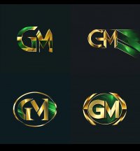
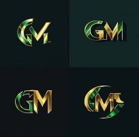
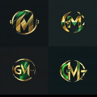
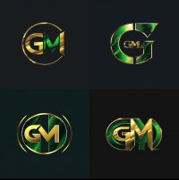
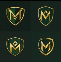
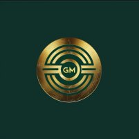
I never liked the interlocking GM (they don’t interlock well visually in the first place), so those who kept asking for it can now live with that demand…
However, having seen both color combinations, the reverse color—green inside gold—is infinitely better than the gold inside green and should be used as the primary logo.
Edit: for those who haven’t seen it, here they are side by side: View: https://twitter.com/MasonAthletics/status/1784980815488696453/photo/1

