Hahaha.... yes. HystericalYou mean something like this:
View attachment 2262
You are using an out of date browser. It may not display this or other websites correctly.
You should upgrade or use an alternative browser.
You should upgrade or use an alternative browser.
News New George Mason Logo
- Thread starter The Great PATSby
- Start date
CHRISTOPHER JAMES JOLLAY
Hall of Famer
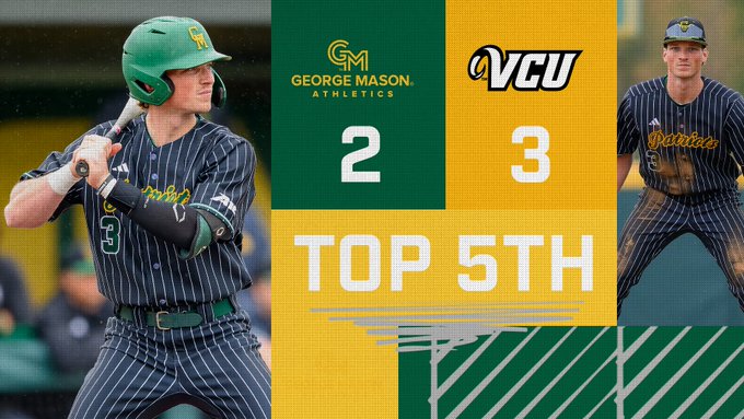
Look how f**king stupid this looks. It looks like a damn Microsoft Outlook signature with the Name, Position Title and Company.

I mean, is the plan to have it be tiny and just pair it with the George Mason all the time? As an explanation?
I may just steal the logo and put it on a polo over General Mills. Cereal.
Brand guidelines haven’t made their way to the baseball team yet.Look how f**king stupid this looks. It looks like a damn Microsoft Outlook signature with the Name, Position Title and Company.

Best X comment I've seen so far.
By George.
Starter
Yes, but that’s not the plan forever. It’s something about athletics not being able to use the logo without the words. It’s kinda confusing.I mean, is the plan to have it be tiny and just pair it with the George Mason all the time? As an explanation?
I may just steal the logo and put it on a polo over General Mills. Cereal.
Huh?Yes, but that’s not the plan forever. It’s something about athletics not being able to use the logo without the words. It’s kinda confusing.
Sounds very Masonish.
I see a baby crawling. Now I can’t unsee it
I see that or even a Ram ☹️I see a baby crawling. Now I can’t unsee it
Look how f**king stupid this looks. It looks like a damn Microsoft Outlook signature with the Name, Position Title and Company.

Did we win the game?
- Thread Starter
- #431
Did we win the game?
Nope. Lost 4-6. So far 0-1 with the poop logo.
We may never win another game.Nope. Lost 4-6. So far 0-1 with the poop logo.
illayin
Sixth Man
what would be revolutionary, if not a bit (very) sell out, would be the quill logo with the adidas three stripes instead
Ditto. Just for the record, I went through all my emails from Mason and could not find any evidence I had been informed of some opportunity to provide feedback or attend a viewing.You generally know that I am a caring a fan, as I know you are as well.. I can count on one hand the number of home games I failed to attend. If there was on opportunity to participate in the development of the new logo then I was never apprised by Mason admin. It's all spilled milk now, though.
I participated in a zoom meeting with a few others on here back in January. While we never saw any possible new logos, I recall a lot of the discussion was around the old logo and how/why it didn't really connect with a lot of us. I do remember discussion about how having a school logo and an athletics logo that intertwined would be nice instead of two that were totally unrelated. At one point there was some talk about the old GM logo and how people liked it/prefered it over the star logo. Really, the gist of it was nobody had a connection with the star logo.
Any discussion of the quill logo?I participated in a zoom meeting with a few others on here back in January. While we never saw any possible new logos, I recall a lot of the discussion was around the old logo and how/why it didn't really connect with a lot of us. I do remember discussion about how having a school logo and an athletics logo that intertwined would be nice instead of two that were totally unrelated. At one point there was some talk about the old GM logo and how people liked it/prefered it over the star logo. Really, the gist of it was nobody had a connection with the star logo.
I don't recall any, other than the mention that you go into our bookstore and you would see two vastly different logos on the products.Any discussion of the quill logo?
I always thought it was pretty normal to have an academic logo and an athletic's logo. I just did a quick look at the first 3 schools in the league I could think of (UD, vcu and SLU) and all three of them appear to have both.I don't recall any, other than the mention that you go into our bookstore and you would see two vastly different logos on the products.
Asking a logo to represent both and also "tell our story" seems like it is asking a lot of a mere logo. If I had to guess, this is the likely cause of what we ended up with.
I just made this logo in 2.5 minutes using the first ai art creation website that came up when I searched. Most of that time was creating the free trial account.
If you capitalized and switched the letters, and darkened the green, I would 100% say this is a better logo.
Edit - this was my first time ever using AI.
If you capitalized and switched the letters, and darkened the green, I would 100% say this is a better logo.
Edit - this was my first time ever using AI.
Attachments
Top Donors
-
Patriotsince81$250.00
-
GSII$100.00
-
Old Man$100.00
-
hoopsjunkie75$50.00
-
GMU1983$50.00
Forum statistics
#MasonNation Network
Check out these great sites:
GiantKiller.co
ByGeorge
Expat Hoops
Fourth Estate
Doc Nix and the Green Machine
Bill Bride - DMV Sports Shots
Patriot Brew Blog/Newsletter
GiantKiller.co
ByGeorge
Expat Hoops
Fourth Estate
Doc Nix and the Green Machine
Bill Bride - DMV Sports Shots
Patriot Brew Blog/Newsletter

