Instant classic.....
You are using an out of date browser. It may not display this or other websites correctly.
You should upgrade or use an alternative browser.
You should upgrade or use an alternative browser.
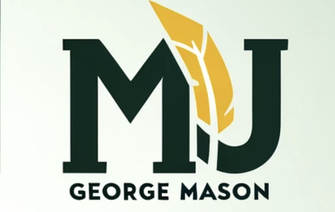
News New George Mason Logo
- Thread starter The Great PATSby
- Start date
They ought to offer a discount on beer rental.Fat Tuesday's just ordered 100 of them.
- Thread Starter
- #543
Rule 34.85
The logo cannot be used unless a whole paragragh is attached to it.
Last edited:
Let's be real they didn't change out that urinal cake that often. I could probably walk in there tomorrow and piss on the same one that collected all my "used beer" 15 years ago.Fat Tuesday's just ordered 100 of them.
If budget gets tight, the baseball team can use them as cups too...
An open letter from Logy, the new logo:
“Hi I'm Logy, the new George Mason University logo. I hear a lot of you are not happy with me. Trust me, I understand. I look really plain, boring, stupid and I don't do a very good job at symbolizing the ideals the administration wants to project.
Well you know, a lot of you look plain boring and stupid and I bet a lot of you aren't really good at your jobs either..... Sorry, I'm just a little frustrated. It's been quite a trying week.
I tried to tell them that I don't really feel this is the best place for me. But they insisted "No!, You're it, man! You are what is going to propel us in the future!". When I would ask exactly how i am going to do that, they either changed the subject, ordered lunch or Darrell Green would start juggling bowling pins for some reason.
For a second there, they actually had me believing that I didn't look like a complete waste of time, resources and bowling pins. I actually thought I didn't look like something that belonged in a playground designed in the 80's. However when I was released, all my worst fears came to fruition.
Thanks to coach Skinn, I'll look a lot better with multiple A10 championship banners with me on them. And with all this winning comes more money, more donations to get rid of me. I don't like this situation any more than you. We both want the same thing, to retire me as the Mason logo. I don't need this shit at my age.”
How’d they taste?I thought they were mints! MY bad......
GunstonsGhost
Sixth Man
Yes, please!!!Got an email from the Center for the Arts yesterday. Looks like they're holdin onto the M quill. There is hope yet!
Instead I would bet its just part of the incompetency of the logo rolloutGot an email from the Center for the Arts yesterday. Looks like they're holdin onto the M quill. There is hope yet!
I hate to say this but its slowly growing on me - I am not visibly angry anymore when I see it.
Probably someone didnt' get notified in time or they contracted the logo before the new logo was out.Instead I would bet its just part of the incompetency of the logo rollout
Something dumb and eyeroll worthy I'm sure though.
GunstonsGhost
Sixth Man
...or the art department would rather not be associated with such a terrible design and they will lead our resistance!
I mean, different strokes for different folks, but I struggle to see how anyone — even a university administrator — could look at the new logo and conclude it’s better than the quill M....or the art department would rather not be associated with such a terrible design and they will lead our resistance!
Hopefully the Center for the Arts folks realized their credibility would be shot by embracing such a nondescript product and said no effing way.
phoenix-arizona
Hall of Famer
I mean, Mason has advertised itself as one of the most diverse colleges in the U.S. for awhile and they had to go away from “where innovation is tradition” since ASU has a monopoly on the innovation front (and believe me #1 in Innovation has been a damn good marketing campaign for ASU).
I also have no problem with the whole inclusion language. It’s also in ASU’s charter (we are defined not by whom we exclude but by whom we include). I just wish George Mason wouldn’t follow suit by defining inclusion through massive enrollment numbers.
But this is also probably straying into politics a little too much.
The ASU Writer's Studio approves this message.
I mean, different strokes for different folks, but I struggle to see how anyone — even a university administrator — could look at the new logo and conclude it’s better than the quill M.
Hopefully the Center for the Arts folks realized their credibility would be shot by embracing such a nondescript product and said no effing way.
(Stepping up onto my soapbox)
The problem with changing most anything is that people become invested in the fact that something "needs" to be changed but not able to answer why. New management comes in (no reflection on Pres. Washington, et al) and wants to make their mark so they must change stuff. Change is usually radical or it's not really change, therefore, in this specific instance, no part of previous logos could even be considered let alone used. Someone in charge needed to check the box of "See what I accomplished" never asking the question of was it needed and is the change an improvement. Change, by definition, is considered improvement in this kind of world.
I have seen many a gov't organization f'd up because new management came in and 'needed' to improve things. They rearrange the deck chairs, relabel stuff, and create more bureaucracy most likely, but they do not actually improve efficiency or effectiveness, which should be the two guiding factors for real change.
(Stepping down of my soapbox)
Go Mason!
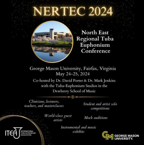
I saw this flier yesterday from the music department about an upcoming Tuba/Euphonium even this month:

I think it looks great in this context. It seems to function better when paired with the full name of the school as per the branding guidelines. The colors definitey play well provided we stay away from the tri-color version with the white included.
I think it'll grow on everyone. Won't ever be some of your's favorite look but the more the school grows around it the better it'll seem.
CHRISTOPHER JAMES JOLLAY
Hall of Famer
I saw this flier yesterday from the music department about an upcoming Tuba/Euphonium even this month:
View attachment 2333
I think it looks great in this context. It seems to function better when paired with the full name of the school as per the branding guidelines. The colors definitey play well provided we stay away from the tri-color version with the white included.
I think it'll grow on everyone. Won't ever be some of your's favorite look but the more the school grows around it the better it'll seem.
I think it looks really sharp when it is placed in the bottom right corner of a flier and takes up no more than 2.5% of the canvas.
I think the smaller you make it the more it will grow on people.
Chat GBT SUCKS. I asked for GMU and it gave me MU lol.

And yet, it is better than the official logo.
Top Donors
-
Patriotsince81$250.00
-
GSII$100.00
-
Old Man$100.00
-
hoopsjunkie75$50.00
-
GMU1983$50.00
Forum statistics
#MasonNation Network
Check out these great sites:
GiantKiller.co
ByGeorge
Expat Hoops
Fourth Estate
Doc Nix and the Green Machine
Bill Bride - DMV Sports Shots
Patriot Brew Blog/Newsletter
GiantKiller.co
ByGeorge
Expat Hoops
Fourth Estate
Doc Nix and the Green Machine
Bill Bride - DMV Sports Shots
Patriot Brew Blog/Newsletter

