You are using an out of date browser. It may not display this or other websites correctly.
You should upgrade or use an alternative browser.
You should upgrade or use an alternative browser.
News New George Mason Logo
- Thread starter The Great PATSby
- Start date
I’m surprised the admin folks in the pic with the new logo don’t have bags over their heads.
With all the negativity throughput the launch of Mason's new logo it makes me wonder who the test group was, or, dare I say, if there even was a test group.
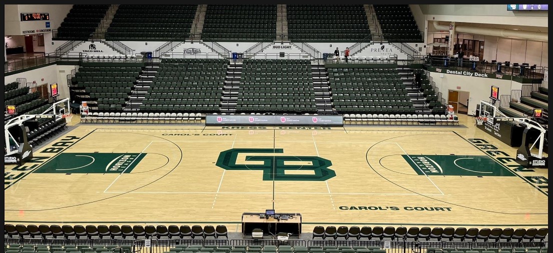
Gee, I wonder if this abomination came from the same design firm that did the logo for University of Wisconsin-Green Bay?

CHRISTOPHER JAMES JOLLAY
Hall of Famer
Can someone tell me why this logo reflects diversity and inclusion like Dr. Washington and others are babbling on about? I have no idea, is it just because it doesn't technically spell out "George" or "Mason?"
The logo is bad. In addition, this school's branding has to be "Mason." That's what alums name their f###ing kids and dogs. Mason.
GM is a car company. "George" is shared by another school 20 minutes away...
Everything sucks. Maybe Mason Day will cheer me up, paying 35 bones for Neon Trees.
Just kidding, that sucks too.
We rag on vcu but they are now more selective in their admissions process than us and anyone of their worthless art school grads could have drawn a better logo than this.
It is time for cleansing fire
JPgmuswim
Starter
Because they said so…..Can someone tell me why this logo reflects diversity and inclusion like Dr. Washington and others are babbling on about? I have no idea, is it just because it doesn't technically spell out "George" or "Mason?
Yes!!View attachment 2289Add a “G” and maybe a “U”. why over think this? The quill needs to stay.
What I’ve been saying all dayView attachment 2289Add a “G” and maybe a “U”. why over think this? The quill needs to stay.
CHRISTOPHER JAMES JOLLAY
Hall of Famer
The ?:
Is at least the old shit in the bookstore like 75% off?
I was just there for Mutts Gone Nuts at the CFtheArts and everything was a ripoff...might go back for dealz
Is at least the old shit in the bookstore like 75% off?
I was just there for Mutts Gone Nuts at the CFtheArts and everything was a ripoff...might go back for dealz
That isn’t an athletics logo either..What I’ve been saying all day
No, but they shouldn't ditch it. It should still adorn their merch.That isn’t an athletics logo either..
I don’t hold the same feeling for the quill as others. I also don’t care about whatever the university mark is. I want a logo that looks good on center court, jerseys, etc.No, but they shouldn't ditch it. It should still adorn their merch.
Should beThat isn’t an athletics logo either..
We disagree. The M with the quill doesn’t belong on any athletic surface, jersey, or apparel.Should be
illayin
Sixth Man
We disagree. The M with the quill doesn’t belong on any athletic surface, jersey, or apparel.
i agree, but i would much rather have it (or a modernized version) as a holdover vs. this current soulless clip art canva "graphic design is my passion" looking logo
It’s the closest thing to an identity Mason has ever had, if you care about that kind of thing.That isn’t an athletics logo either..
Top Donors
-
Patriotsince81$250.00
-
GSII$100.00
-
Old Man$100.00
-
hoopsjunkie75$50.00
-
GMU1983$50.00
Forum statistics
#MasonNation Network
Check out these great sites:
GiantKiller.co
ByGeorge
Expat Hoops
Fourth Estate
Doc Nix and the Green Machine
Bill Bride - DMV Sports Shots
Patriot Brew Blog/Newsletter
GiantKiller.co
ByGeorge
Expat Hoops
Fourth Estate
Doc Nix and the Green Machine
Bill Bride - DMV Sports Shots
Patriot Brew Blog/Newsletter
