You are using an out of date browser. It may not display this or other websites correctly.
You should upgrade or use an alternative browser.
You should upgrade or use an alternative browser.
New Mason uniforms
- Thread starter Mason Trooper
- Start date
I am just thankful that they have the large "TM" on the logo. I was worried someone might try to steal it if we didn't...I like the tops. The General Motors logo on the side is obnoxiously too big and in an awkward spot on the side. Even though I hate the logo, putting it at the bottom corner at a smaller size like previous years would have been more aesthetically pleasing.
Also even though its not an approved color variant, it could look better if the inside of "GM" was White to match the Lettering and Numbers.
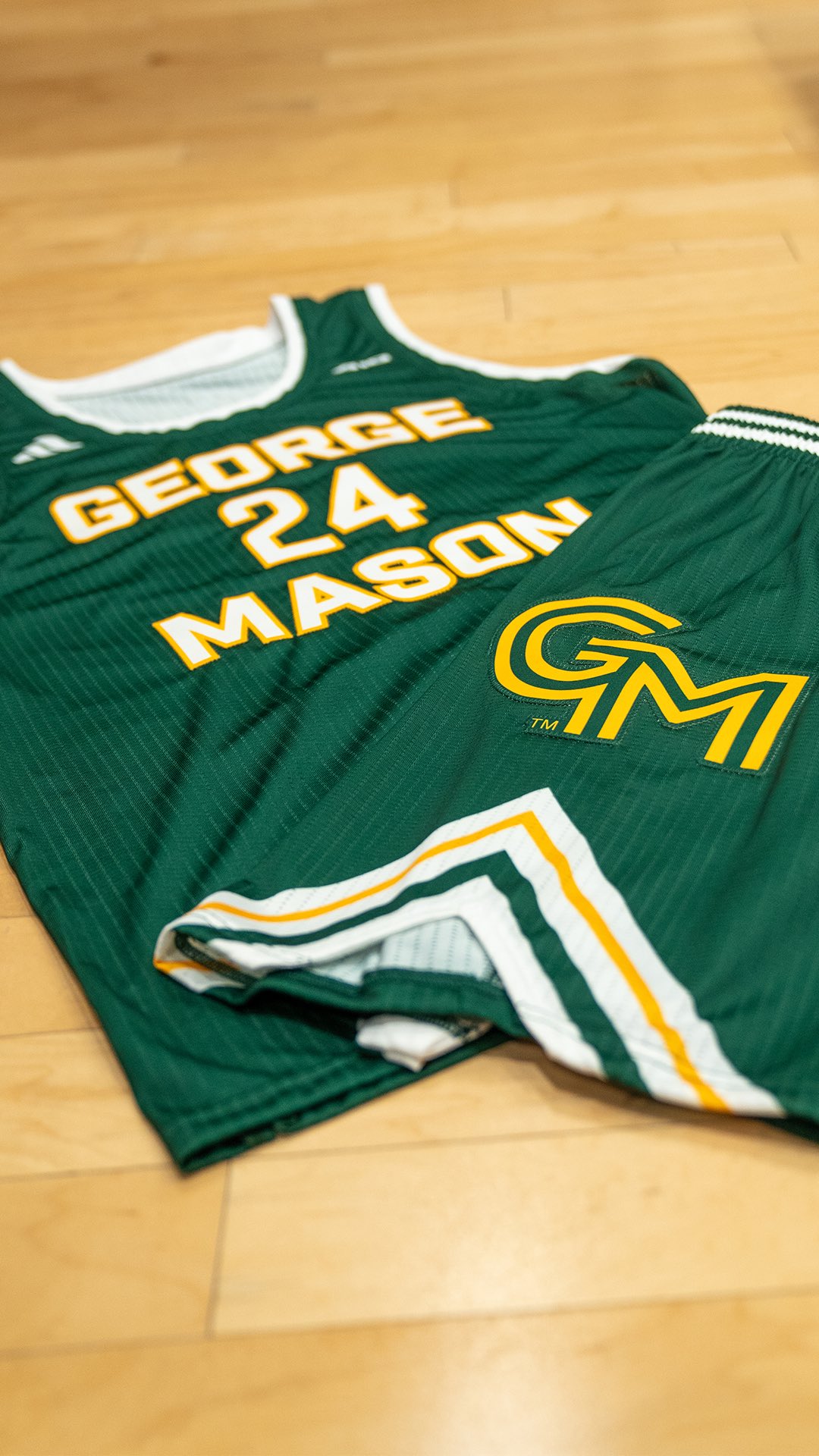
An interesting (to me at least) observation about the logo is that, in a way, it doesn't follow the guidelines. It is probably because of the way it has to be manufactured, but, if you look closely there is a green outline around the logo. That is one of the problems with the logo is that it doesn't have an alternate color outline, so it gets washed out on different color backgrounds, thus why we have so many versions of it (that frequently get used improperly). If they made that part of the logo, and closed the maze openings/exits off, it would be significantly better, but, alas I am living in fantasy land.
Agree 100%. More proof that this was not a well-thought out decision.
Logo looks odd from the front since the tiered GM causes it to be asymmetrical.

It's what happens when you hire designers who don't take that into account. Branding and design Is way more than slapping colors down and just picking a font. Said it from the begining, it would end up hard to execute this design given the guidelines. Part of this is on Adidas too though, it's not that difficult to match colors. I wonder if Adidas is struggling to find employees who know what they are doing? Mason should have rejected these and told them to fix it! It's legit a science, there's a CMYK color, Hex, PMS or whatever specific color model they follow. Unacceptable, and failed branding from the get go. While I don't mind the actual design for the jersey's again it's a little strange how the details always seem to get screwed up.
An interesting (to me at least) observation about the logo is that, in a way, it doesn't follow the guidelines. It is probably because of the way it has to be manufactured, but, if you look closely there is a green outline around the logo. That is one of the problems with the logo is that it doesn't have an alternate color outline, so it gets washed out on different color backgrounds, thus why we have so many versions of it (that frequently get used improperly). If they made that part of the logo, and closed the maze openings/exits off, it would be significantly better, but, alas I am living in fantasy land.
GunstonsGhost
Sixth Man
Those shorts can't be very comfortable either with that embroidered patch potentially jabbin you in the junk all the time.
I'm still boycotting any new logo apparel. But I might make this into a shirt and wear it to games.

Instead of the small TM at the bottom, you should make that GM.I'm still boycotting any new logo apparel. But I might make this into a shirt and wear it to games.
View attachment 2394
I'm still boycotting any new logo apparel. But I might make this into a shirt and wear it to games.
View attachment 2394
I'd buy one of those!Instead of the small TM at the bottom, you should make that GM.
I'd buy one of those!
Let's kill two birds with one stone. Put these on the Patriot Collective page. Supporting Mason's NILs while also saying F U to the Mason Administration is a win-win.
Last edited:
It's tough not to just laugh. Who TF saw those shorts and said: "Yep!"
Can’t they just get rid of the logo? It’s a nice clean uniform without it.
Can’t they just get rid of the logo? It’s a nice clean uniform without it.
I agree. The giant logo on the shorts looks like a**. But I’m sure it’s part of their re-branding plan. Even if you replaced the new logo with the old logo, the shorts would still look stupid.
You know its interesting that 1) the players liked them and 2) Tony mentioned that he was involved in the design of the uniforms, according to the video. Whether #1 was just because they have to or they like them, who knows.Just saw video from the team’s media day and if possible, I hate the logo even more. Just way way way too big on the side of the shorts — looked bad in a photo, looks absolutely ridiculous in real life.
I actually thought they looked better on the players than in those display posts but whatever.
End of the day as long as we win I'm good.
Link to the media day?Just saw video from the team’s media day and if possible, I hate the logo even more. Just way way way too big on the side of the shorts — looked bad in a photo, looks absolutely ridiculous in real life.
Why would they pay us to have a CM logo on our uniforms?If we are going to put a massive GM on the side of our shorts can’t we get General Motors to pay us for that much real estate? That way at least I can accept we are getting something out of looking ridiculous. Why do we have to do it to ourselves?
Top Donors
-
 Patriotsince81$250.00
 -
 GSII$100.00
 -
 Old Man$100.00
 -
hoopsjunkie75$50.00
-
 GMU1983$50.00
Forum statistics
#MasonNation Network
Check out these great sites:
GiantKiller.co
ByGeorge
Expat Hoops
Fourth Estate
Doc Nix and the Green Machine
Bill Bride - DMV Sports Shots
Patriot Brew Blog/Newsletter
GiantKiller.co
ByGeorge
Expat Hoops
Fourth Estate
Doc Nix and the Green Machine
Bill Bride - DMV Sports Shots
Patriot Brew Blog/Newsletter