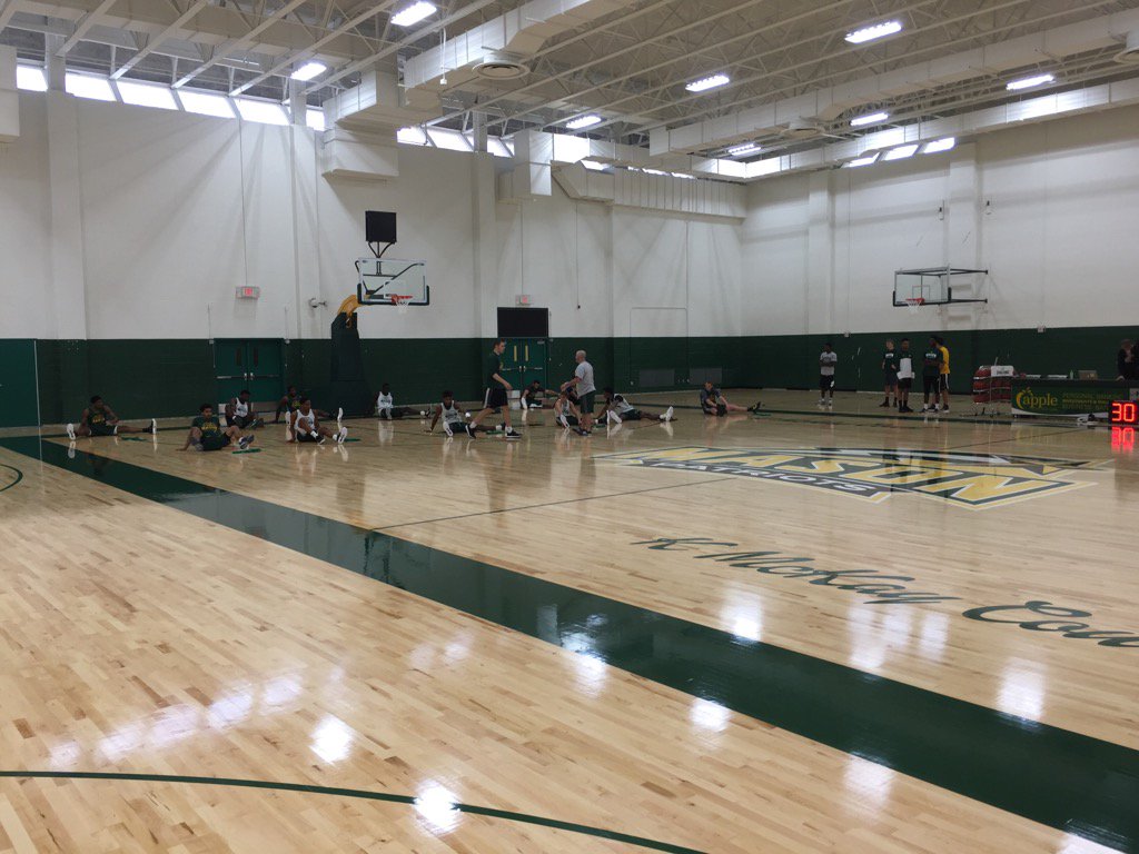
Picture please?
Sorry, didn't snag any. I'll get some next time I'm in the RAC
Picture please?

I would assume that is a safe assumption.^^From Paulsen's Twitter. I assume they're planning to add graphics/images to the walls at some point?
I would like to see Jollay quotes painted on all four walls
^^From Paulsen's Twitter. I assume they're planning to add graphics/images to the walls at some point?
I would like to see Jollay quotes painted on all four walls
I think GMU05 quotes would be excellent motivators. Every time one of our guys steps to the line in practice he'll remember "some random douche on the internet thinks I suck. I should probably make this shot".As long as it doesn't have negativity from GMU05, anything associated with Paul Hewitt or vcu, I'm good with whatever.

^^From Paulsen's Twitter. I assume they're planning to add graphics/images to the walls at some point?
Interesting Orientation of the building....also kind of a weird design. Much better than the current shithole though.So there are updates about the Robinson Hall project. It looks like they're knocking down both Robinsons, building a new building on Robinson A, creating a new open courtyard and ampitheater on the site of Robinson B, and leaving Harris Theater as a standalone building. Completion is slated to be somewhere in 2022.
See for yourself:
https://www2.gmu.edu/news/453336?ut...m_content=robinson-hall&utm_campaign=newsdesk
I like it progress ---- bitches.
You're a progressive! I knew it!
Interesting Orientation of the building....also kind of a weird design. Much better than the current shithole though.
It's a nice building but it's going to look wildly out of placeThis is sweet
It's a nice building but it's going to look wildly out of place
I actually disagree - if you look at the use of brick, color, windows and curves -- it borrows a lot from the new Library and HHS building. I think it will look great and it opens up that plaza and gives one hell of a long site line.
The architecture is in line with everything else, no doubt. Mason's done well to have a uniform style. My qualm is with the orientation of it. Seems like it should be running the other way in the way the old Robinson does. I think they're doing it this way because they can shorten the time frame but I think it looks goofy as is. But hey, maybe when it'll look better in person.I actually disagree - if you look at the use of brick, color, windows and curves -- it borrows a lot from the new Library and HHS building. I think it will look great and it opens up that plaza and gives one hell of a long site line.
The architecture is in line with everything else, no doubt. Mason's done well to have a uniform style. My qualm is with the orientation of it. Seems like it should be running the other way in the way the old Robinson does. I think they're doing it this way because they can shorten the time frame but I think it looks goofy as is. But hey, maybe when it'll look better in person.
