Yes, I like the idea of sticking to something simple. But it still needs work in my opinion.This M?

You are using an out of date browser. It may not display this or other websites correctly.
You should upgrade or use an alternative browser.
You should upgrade or use an alternative browser.
News Tracking Official Adidas / Other Gear
- Thread starter Robot
- Start date
Obviously, I am not going to take too much time to make a logo, but I think you can get the idea. I just wish the feather in the M actually looked like a real feather.
This way Mason can embrace the fact that George Mason drafted the Bill of Rights.
This way Mason can embrace the fact that George Mason drafted the Bill of Rights.
Attachments
You are referencing the academic logo. Whereas the star (even though they are breaking their own guidelines) is part of the athletic logo. Not that they couldn’t use the same for both...Obviously, I am not going to take too much time to make a logo, but I think you can get the idea. I just wish the feather in the M actually looked like a real feather.
This way Mason can embrace the fact that George Mason drafted the Bill of Rights.
Love the MYes, I like the idea of sticking to something simple. But it still needs work in my opinion.
Quentin Daniels
Hall of Famer
After all, nothing says athletic competition quite like a nice feathered quill!
After all, nothing says athletic competition quite like a nice feathered quill!
Quills are pretty sharp. In fact some say its mightier than the sword.
Quentin Daniels
Hall of Famer
Quills are pretty sharp. In fact some say its mightier than the sword.

The bookstore has a few new Adidas items for sale:
https://gmu.bncollege.com/webapp/wc...=10001&langId=-1&storeId=15552&topCatId=40510
I know I've seen some of our players/staff wearing this design in a long sleeve - this seems to be the main design for Adidas this year for football and basketball:

https://gmu.bncollege.com/webapp/wc...=10001&langId=-1&storeId=15552&topCatId=40510
I know I've seen some of our players/staff wearing this design in a long sleeve - this seems to be the main design for Adidas this year for football and basketball:

PDGL Hoops
Starter
Every time someone posts new and cool looking athletic wear I start looking, fill up my cart, check the price, and then picture a murder scene being covered by the local news because a wife killed her husband after dropping $350 on Mason gear.
I feel your pain.
I had to put an end to it last year. I got more frustrated with the lack of gear, so now I just make my own (for personal use only, of course).
I had to put an end to it last year. I got more frustrated with the lack of gear, so now I just make my own (for personal use only, of course).
Every time someone posts new and cool looking athletic wear I start looking, fill up my cart, check the price, and then picture a murder scene being covered by the local news because a wife killed her husband after dropping $350 on Mason gear.
To make her feel better just tell her it’s less than half of what you usually drop at the local strip club.
Perspective does wonders
Sent from my iPhone using Tapatalk
I didn't realize the women's team has a gold alternate uniform. they wore it last night at SLU:
https://twitter.com/MasonWBB/status/1091162759939743744
https://twitter.com/MasonWBB/status/1091162759939743744
I didn't realize the women's team has a gold alternate uniform. they wore it last night at SLU:
https://twitter.com/MasonWBB/status/1091162759939743744
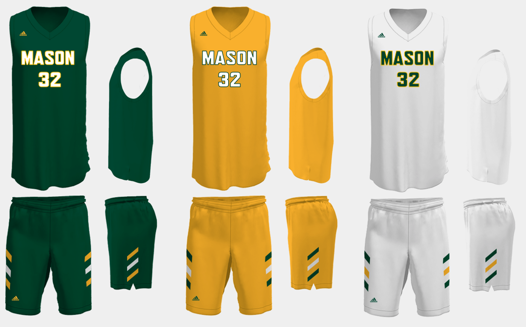
Gotta get a gold set for the men too. Long overdue.
patriotchild
Starter
Yeah. I miss the gold jerseys. Helps us differentiate from all the other green and gold teams we play.
Also think they’d be good to use to “relaunch” the mason basketball brand. I’d like to see some different options for how to creatively blend green and gold, with gold being the primary color. Don’t want to end up looking like that team down south though.
Also think they’d be good to use to “relaunch” the mason basketball brand. I’d like to see some different options for how to creatively blend green and gold, with gold being the primary color. Don’t want to end up looking like that team down south though.
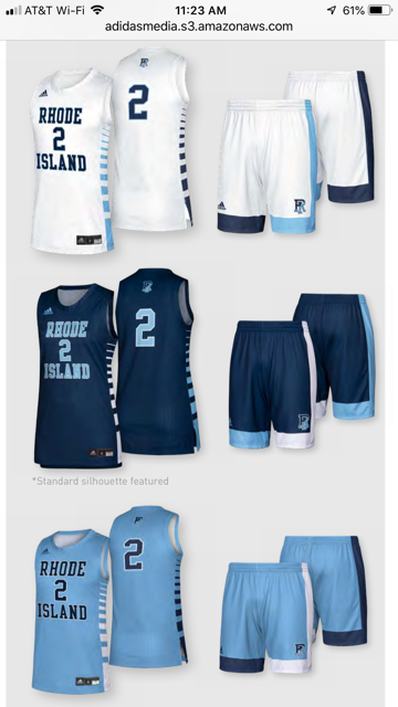
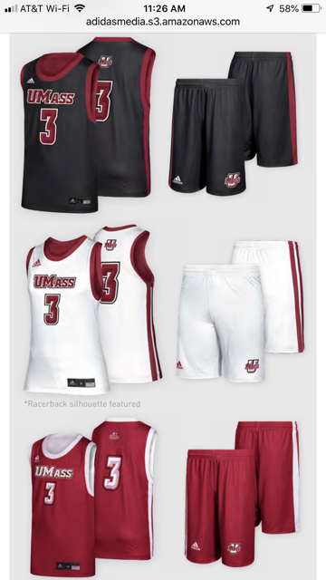
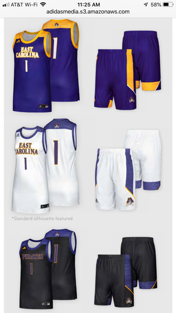
The new Adidas catalog recently came out. Here are some of the new styles (unfortunately some modeled by some of our A10 opponents):
The Zone Jersey:
The Signature Jersey:
The 365 Jersey:
And a jersey I like from last year, the Uprising:
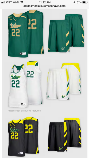
I like the Zone - but I don't like doing different colors for each leg like the Rhode Island uni has. Not a fan of Signature or the 365. Really like the possibilities of the Uprising, but don't really like the shoulder colors - would get rid of that and just do the alternating stripes on the shorts kind of similar to our current style, just updated.
The Zone Jersey:
The Signature Jersey:
The 365 Jersey:
And a jersey I like from last year, the Uprising:
I like the Zone - but I don't like doing different colors for each leg like the Rhode Island uni has. Not a fan of Signature or the 365. Really like the possibilities of the Uprising, but don't really like the shoulder colors - would get rid of that and just do the alternating stripes on the shorts kind of similar to our current style, just updated.
Last edited:
NO DAY-GLO, NUCLEAR FUSION, FLUORESCENT COLORS OF ANY KIND!!!Bring back "George Mason" and time for a kryptonite green uni as our home white. Can that be done?
Bring back "George Mason" and time for a kryptonite green uni as our home white. Can that be done?
Totally agree. Please bring back George Mason on the front and player's names on the back.
And stop switching uniforms every gad damn year. The concept of brand consistency is completely obsolete here in the athletics department. Stop switching uniform designs every year.... cool to do it a few times over a 8-10 year span to keep it fresh but doing it every year is killing identity.
We are in our 4th season with Adidas and I think this is only our second set of uniforms. I'm not sure if thats because of our contract with Adidas or budget or something else. My guess is its budget related and we only want to spend every other year; meaning, we'll see a new design next season.
Top Donors
-
Patriotsince81$250.00
-
GSII$100.00
-
Old Man$100.00
-
hoopsjunkie75$50.00
-
GMU1983$50.00
Forum statistics
#MasonNation Network
Check out these great sites:
GiantKiller.co
ByGeorge
Expat Hoops
Fourth Estate
Doc Nix and the Green Machine
Bill Bride - DMV Sports Shots
Patriot Brew Blog/Newsletter
GiantKiller.co
ByGeorge
Expat Hoops
Fourth Estate
Doc Nix and the Green Machine
Bill Bride - DMV Sports Shots
Patriot Brew Blog/Newsletter

