I hate that we don't know why. Where you been, man?I hate that I haven't been here in a looong time.
You are using an out of date browser. It may not display this or other websites correctly.
You should upgrade or use an alternative browser.
You should upgrade or use an alternative browser.
Hate ....
- Thread starter Old Man
- Start date
Portlandian
Hall of Famer
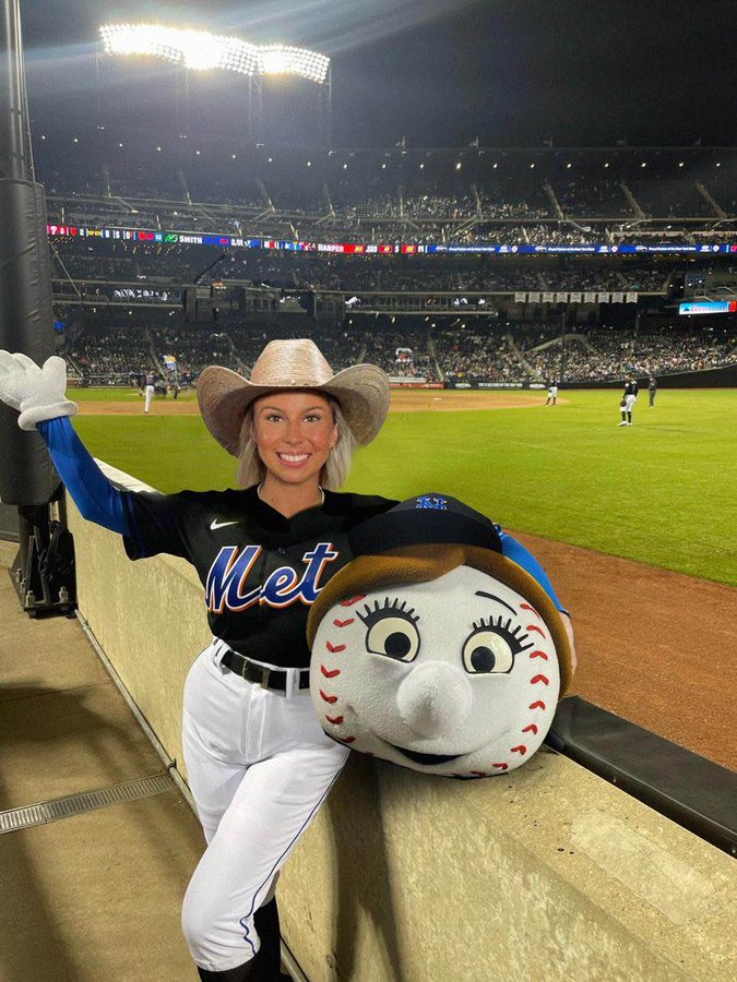
I don't hate the world series tournament final 4. Go Mets.
Portlandian
Hall of Famer
I love Hawktober!


FreeGunston12
All-American
I hate being the most generic university imaginable. I thought maybe after seeing our guys take the court with the new logo that it might start to grow on me. NOPE. It is distractingly bad. The whole court looks so disjointed with that atrocity at midcourt, the “George Mason” on both baselines, and the Patriots script on the baskets.
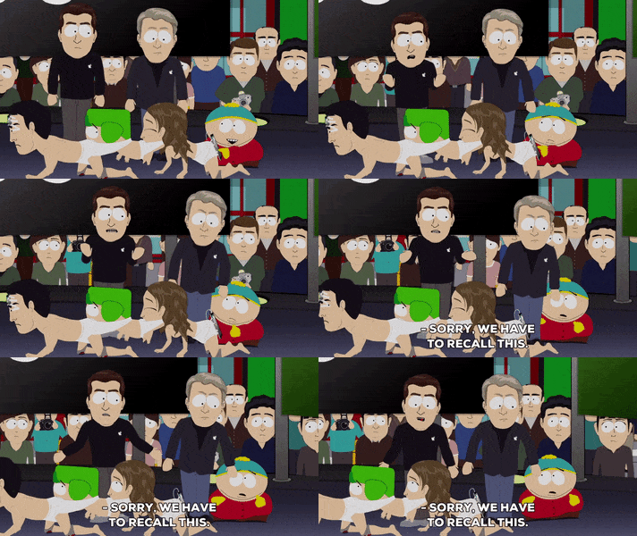
Can someone do a quick photoshop and put three crawling baby logos together, like the human centipede below? That might help express how disgusting the logo truly is.

Can someone do a quick photoshop and put three crawling baby logos together, like the human centipede below? That might help express how disgusting the logo truly is.

Last edited:
Portlandian
Hall of Famer
I don't hate jumping on the Commanders' bandwagon train for this year's playoffs. Washington or Detroit in the Super Bowl please!
Last edited:
Same, I'm a Niners fan but Wife is a long dormant, recently revived, Commanders fan - as well as lots of friends and family - so I'm happy to be rooting for them for the first time in my life.I don't hate jumping on the Commanders bandwagon train for this year's playoffs. Washington or Detroit in the Super Bowl please!
Same with Ravens - lots of family in Baltimore and used to live there myself. Rooting for a Beltway Bowl!
Lions would also be awesome for their long suffering fans - would be amazing to see a qb trade that netted a super bowl for each time.
I don't hate to say SKOL!!!I don't hate jumping on the Commanders bandwagon train for this year's playoffs. Washington or Detroit in the Super Bowl please!
I don't hate these sentiments, but I do hate the hate thread violation.Same, I'm a Niners fan but Wife is a long dormant, recently revived, Commanders fan - as well as lots of friends and family - so I'm happy to be rooting for them for the first time in my life.
Same with Ravens - lots of family in Baltimore and used to live there myself. Rooting for a Beltway Bowl!
Lions would also be awesome for their long suffering fans - would be amazing to see a qb trade that netted a super bowl for each time.
Where's the party?
Starter
I hate that so many have caved and are calling them the Commanders ..... Long live the Skins!
And God Bless Jayden Daniels for making us relevant again!
And God Bless Jayden Daniels for making us relevant again!
I hate that so many have caved and are calling them the Commanders ..... Long live the Skins!
And God Bless Jayden Daniels for making us relevant again!
...and for banishing Danny-boy Schneider to
the hated woodshed.
Milt Mudflap
Preferred Walk-On
I hate those three refs from today’s game.
I hate vcu
I LOVE St. Joe's.
But only when they are playing against VCPoo.
But only when they are playing against VCPoo.
Top Donors
-
Patriotsince81$250.00
-
GSII$100.00
-
Old Man$100.00
-
hoopsjunkie75$50.00
-
GMU1983$50.00
Forum statistics
#MasonNation Network
Check out these great sites:
GiantKiller.co
ByGeorge
Expat Hoops
Fourth Estate
Doc Nix and the Green Machine
Bill Bride - DMV Sports Shots
Patriot Brew Blog/Newsletter
GiantKiller.co
ByGeorge
Expat Hoops
Fourth Estate
Doc Nix and the Green Machine
Bill Bride - DMV Sports Shots
Patriot Brew Blog/Newsletter
