That’s good news, but wouldn’t they want the film room in the practice facility?From the email that was sent out:
“The next step in the Basketball Excellence Plan, Phase II, will consist of complete design and construction of an addition to the Basketball Practice Facility. The scope of the project includes adding practice facility locker rooms, training and sports medicine performance areas and offices for the coaching staffs.”
You are using an out of date browser. It may not display this or other websites correctly.
You should upgrade or use an alternative browser.
You should upgrade or use an alternative browser.
News Finished Locker Room pics
- Thread starter GMU_DCU
- Start date
Dawgs99
Starter
That’s good news, but wouldn’t they want the film room in the practice facility?
I'm pretty sure they have TV's built into the wall in certain areas of the practice gym.
I counted 13 lockers in the video. Since the team is only allowed 13 scholarships, I guess walk-ons don’t get a locker. However, I did see a Jack Tempchin name plate. Perhaps they gave the last remaining scholarship to him, or he gets a locker because they currently have one available.
I counted 13 lockers in the video. Since the team is only allowed 13 scholarships, I guess walk-ons don’t get a locker. However, I did see a Jack Tempchin name plate. Perhaps they gave the last remaining scholarship to him, or he gets a locker because they currently have one available.
There are 14 lockers. In the video you can see one on the right side with no name plate over it. That’s locker 14.
I counted at least 16. There's no shortage of space.There are 14 lockers. In the video you can see one on the right side with no name plate over it. That’s locker 14.
If you look up MasonWBB on Instagram, they have some locker closeups.Looking forward to the By George tour coming out soon. I’ve been at some coaching clinics where vendors have lockers on display. You can see that each locker has an outlet for charging items which is great. I’m wondering if they have ventilation in any of the drawers that help dry equipment/shoes - those are awesome and help reduce the locker room smell. Also, wondering what the seating is like for players in the actual locker room are? Stools or new chairs?
I’m kind of a equipment nerd, so I realize this isn’t probably interesting for most.
My mistake. In the video the lockers are closed, and I just counted the name plates. That’s what I get when for searching for something that just is not there.I counted at least 16. There's no shortage of space.
By George.
Starter
https://giantkiller.co/2019/06/27/video-tour-of-new-george-mason-basketball-locker-rooms/
Cali Shows Bryan around the new locker room and chats about how thankful he is for all the donations and fan support. This kid is A+
Cali Shows Bryan around the new locker room and chats about how thankful he is for all the donations and fan support. This kid is A+
I agree with almost everything (maybe everything) the great 52 posts, and I still agree with your sentiment about the star only logo, mostly because it goes against their own style guide (unless they finally updated it to allow the star only).The pics look very nice. I do hate using the star logo on anything and the fact they used it on the glass makes me ill, but I'd rather be ill about that then not having new locker rooms at all.
BUT... I think they did a fabulous job on the locker rooms. There is so much Mason branding in there. Just great. So, given the ultra wide and short space where they used it, in addition to wanting to be able to see through it, combined with the other proper branding, I think it is excusable, maybe understandable, and at the risk of incurring your wrath, go almost as far as saying it looks pretty good. If that was the primary branding, I would think otherwise. But given how subdued that is verses how the other branding just pops out, it fits in nicely.
I hope they have the budget to keep the nameplates up-to-date as the years go on because those are nicely done. I’d hate to find out those are too costly for them to replace properly when needed. I see that in so many places, mostly offices.
The By George guys did a great job with this. Thank you!
I kept looking to see if there was anything I could nitpick about, but there really wasn’t. Once they get the technology squared away for the tv and are able to hide the wires, it really is 100% first class all the way.
The other great thing was getting to see Greg interact on camera. I haven’t really gotten to see him (or many of our players) interact like this on camera unless it’s an interview right after a game. I would love to see more of our guys off the court to get to know them better - as a fan it allows me to feel more attached to the program and I'm more invested in the player/team. Since we have so many high character guys, please market them more!!!
By George.
Starter
The By George guys did a great job with this. Thank you!
I kept looking to see if there was anything I could nitpick about, but there really wasn’t. Once they get the technology squared away for the tv and are able to hide the wires, it really is 100% first class all the way.
The other great thing was getting to see Greg interact on camera. I haven’t really gotten to see him (or many of our players) interact like this on camera unless it’s an interview right after a game. I would love to see more of our guys off the court to get to know them better - as a fan it allows me to feel more attached to the program and I'm more invested in the player/team. Since we have so many high character guys, please market them more!!!
Appreciate you! If you follow our stuff, you know how much we love Cali. Guy could have been a game 1 starter the last 2 seasons and remains incredibly humble and hungry.
PS - in the interview we asked if he’d represent us in an A10 Royal Rumble, he responded, “definitely.”
JPgmuswim
Starter
Appreciate you! If you follow our stuff, you know how much we love Cali. Guy could have been a game 1 starter the last 2 seasons and remains incredibly humble and hungry.
PS - in the interview we asked if he’d represent us in an A10 Royal Rumble, he responded, “definitely.”
Did you happen to ask anyone if and when new uniforms are coming?
By George.
Starter
Did you happen to ask anyone if and when new uniforms are coming?
I didn’t, but it’s cause we assume we’re getting new ones.
I am humbled.I agree with almost everything (maybe everything) the great 52 posts, and I still agree with your sentiment about the star only logo, mostly because it goes against their own style guide (unless they finally updated it to allow the star only).
BUT... I think they did a fabulous job on the locker rooms.
But given how subdued that is verses how the other branding just pops out, it fits in nicely.
And I do think they did a fabulous job as well on the project, just hated star on the glass. But to your point, its subdued.
And to the By George team, awesome video and interview.
I love you guys! This is inside stuff we could of only had dreamed of before. I want to donate. Please provide the link to do so again.https://giantkiller.co/2019/06/27/video-tour-of-new-george-mason-basketball-locker-rooms/
Cali Shows Bryan around the new locker room and chats about how thankful he is for all the donations and fan support. This kid is A+
I love you guys! This is inside stuff we could of only had dreamed of before. I want to donate. Please provide the link to do so again.
I believe their Venmo is @TheGreatPatsby
By George.
Starter
I love you guys! This is inside stuff we could of only had dreamed of before. I want to donate. Please provide the link to do so again.
Working on a donations landing page for Giantkiller.co today.
Thanks man!
The audio interview coming out Tuesday is pretty good too. Nothing groundbreaking but you’ll learn more about Calixte.
Updated: Here is the GK website highlighting our accomplishments and goals - https://giantkiller.co/become-a-giantkiller-supporter/
And here’s the Patreon account, we’ll be adding swag to the tiers and will have raffles for ticket giveaways and other game day items etc - https://www.patreon.com/gmugiantkiller/overview
If you’d just like to Venmo us directly, DM me. Thanks, again guys! We have big time goals this season.
Last edited:
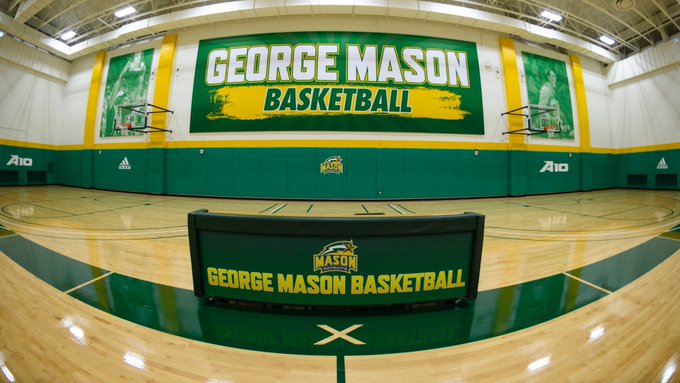
They finally got graphics up in the practice facility.


Top Donors
-
Patriotsince81$250.00
-
GSII$100.00
-
Old Man$100.00
-
hoopsjunkie75$50.00
-
GMU1983$50.00
Forum statistics
#MasonNation Network
Check out these great sites:
GiantKiller.co
ByGeorge
Expat Hoops
Fourth Estate
Doc Nix and the Green Machine
Bill Bride - DMV Sports Shots
Patriot Brew Blog/Newsletter
GiantKiller.co
ByGeorge
Expat Hoops
Fourth Estate
Doc Nix and the Green Machine
Bill Bride - DMV Sports Shots
Patriot Brew Blog/Newsletter
